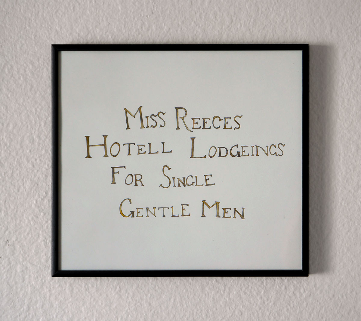
In This Place A Man Has Been
When myself and my wife were in Cape Town not that recently we visited an old castle close to the downtown core. As a tourist attraction it was a relative clunker, but it did offer a welcome lull during our first hours on the continent, during which I remember feeling pretty tense regarding the potential sudden murder of myself and my then-girlfriend.
The best part (the only part I remember, really) was a series of small holding cells, I presume for folks bound for the much more grim dungeons below. I was immediately drawn to the wordy, often humorous strings of letters prisoners had etched into the wood lining the wrought-iron doors. In retrospect I don't know the circumstances under which the writings were made, as I assume any pocketknives would have been confiscated upon admittance, but this was the 17th century and maybe they hadn't figured that one out yet.
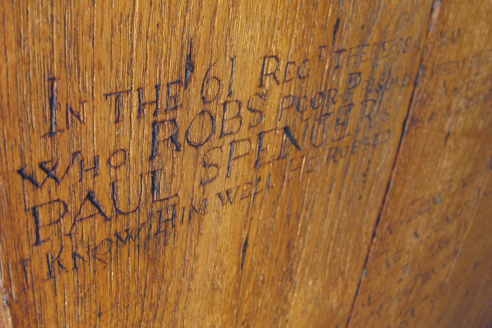
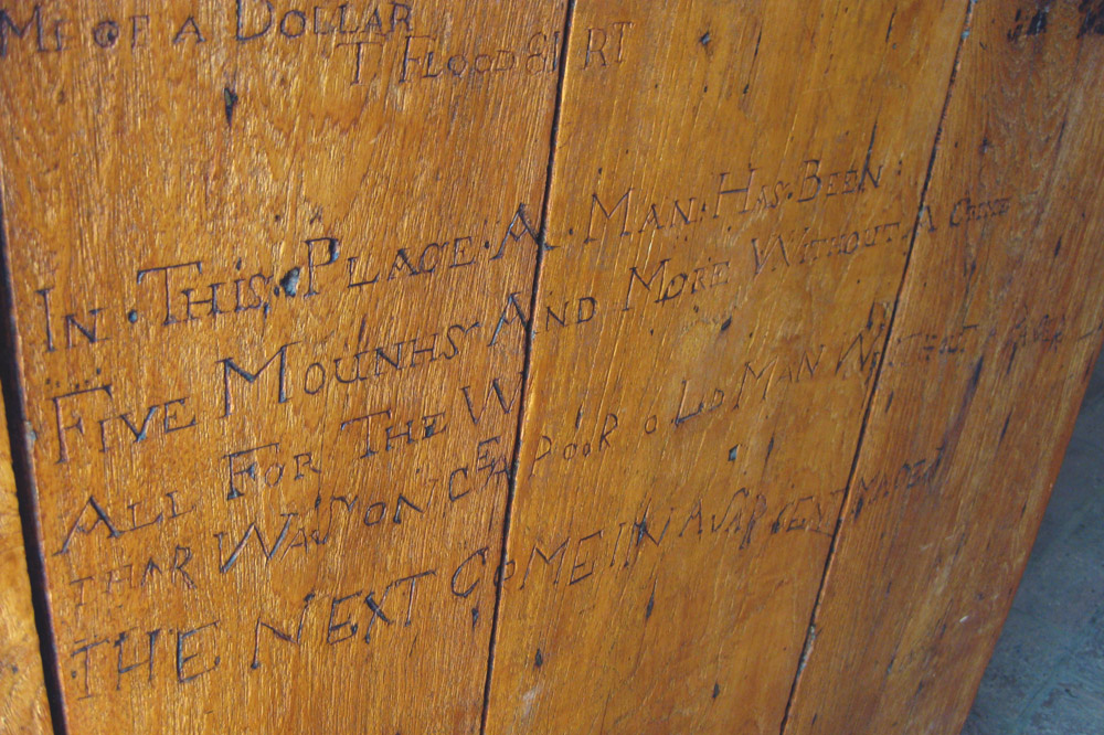
Regardless, what drew me was the style—and, more suprisingly, the consistency, as there must have been a point in history when the small-cap roman letterform was such a part of the day-to-day graphic vernacular that it was the de facto medium even for the prison scribblers. Myself in 2015 can't remember which side of the 'A' should be fat and which should be thin, but in 1676 a rotating cast of petty thieves could all maintain a consistent x-height and almost mathematical baseline despite having spent the last six months in the various ballasts of syphillitic Dutch trading ships, eating seaweed.
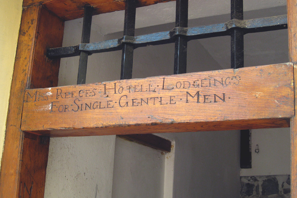
Anyways, I thought it was all the greatest. I made some art, because typography, sardonic humour and old-timey dungeons is maybe the best Venn diagram I can think of right now.